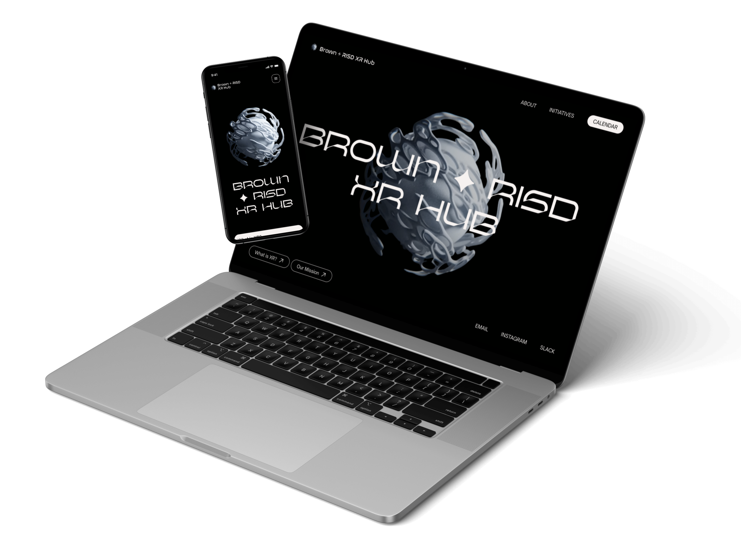
visual identity
design system
web design
OVERVIEW
Brown + RISD XR Hub is a student-led organization at Brown University and the Rhode Island School of Design that aims to explore VR and AR technologies through collaborative projects, workshops, and field trips.
Timeline
May - July 2023
Location
Remote
ROLE
As the sole designer partaking in this project, I designed and prototyped a website for both mobile and desktop formats, taking inspiration from a collaborative moodboard my team and I previously created.
Collaborative moodboard developed over the months of April-May.
With little to no direction, I defined a few goals for this project based on discussions during our weekly meetings about the club's desired image and values and the technical limitations we faced.
Technicalities
Support 3D assets or video
Having a 3D interactive logo on the homepage or a video.
Can hand off to developers
This website would be coded from scratch without using external website builders.
Promoting Values
XR as an inclusive field
Create a safe space for students to explore XR since it's not accessible to most people.
Our club as "cool" club
Leave a lasting impression on students through visual assets and widely increase our membership.
This was my first time designing and prototyping a full website alone. Since I had a lot of copy to work with, I initially struggled with finding a balance between visual appeal and readability.
When I first designed the website, about a month before embarking on the redesign project, I was much less experienced with Figma and web design in general and didn't know much about auto layout, for example. At that time, my goal was solely to create an eye-catching website to garner more interest in our club. After reviewing my designs a month later, especially after working on a few UX projects for my internship, I was able to instantly pinpoint issues with the website that needed to be fixed.
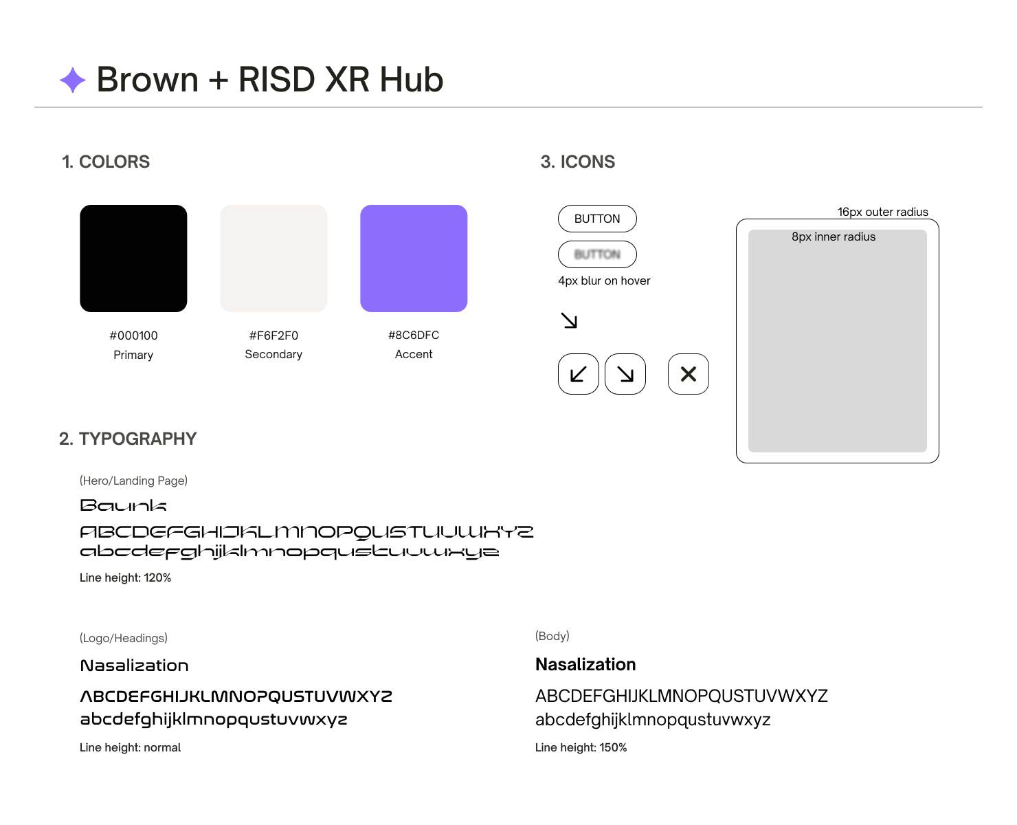
COLOR PALETTE
I selected a dark background for a dark mode website, creating a more techy vibe and emulating the immersiveness of XR. In contrast, the light secondary color has a hint of pink to juxtapose the cooler-toned palette. Purple helped create a futuristic, sci-fi look while being less corporate than the blue and gray colors we originally planned to work with.
TYPOGRAPHY
After playing around with multiple font pairings, I settled with two more futuristic, techy typefaces paired with a more plain but clean font. Most of the techy fonts I came across looked cool but were difficult to read. Since I was designing a club website, I prioritized readability and was still able to achieve a futuristic look.
Both the colors and typography helped make the website more accessible and less intimidating while still maintaining a fitting XR look.
Readability
Improve the visual layout of the website by increasing overall font size, choosing more precise font hierarchies and spacing between texts, and using more column layouts to prevent text from spanning the entire width of a page.
Usability
Increase ease of use by putting buttons closer together to minimize mouse movement and on the right side of the screen to follow the natural mouse position of most people.
User Experience
Adding more mouse interactions by using various buttons to group information and reducing clutter while also providing a more meaningful and interesting experience to users interacting with the site.
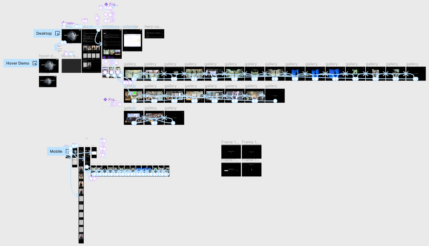
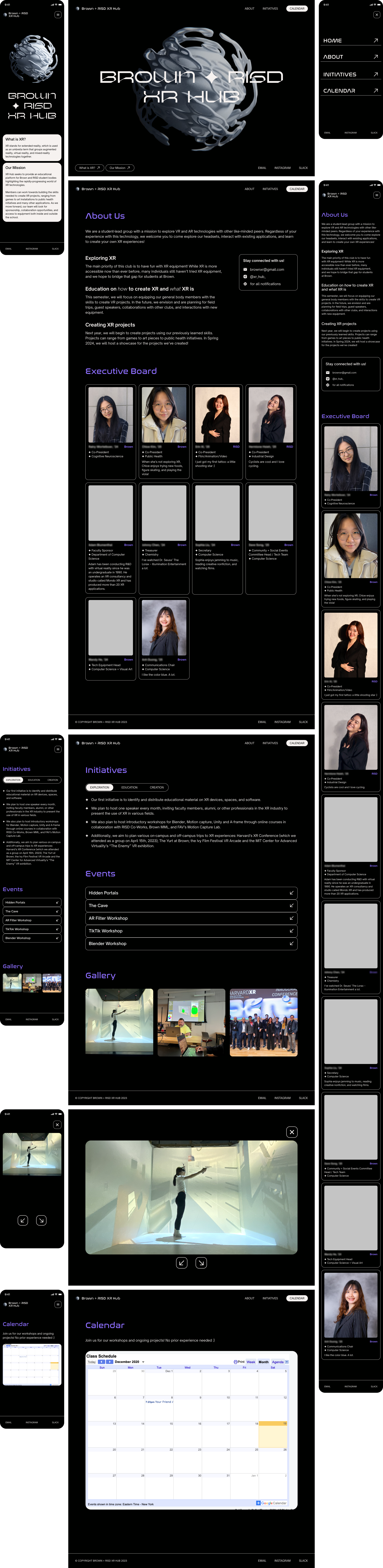
The final iteration of screens I created. Figma components really are a gamechanger.
Note: We don't have a logo yet so the 3D image used as the logo and landing page background is just a placeholder.
01. Homepage
More immersive and accomodates for an appealing visual, especially a video format. Extra information can be toggled on and off. Mouse interactions added.
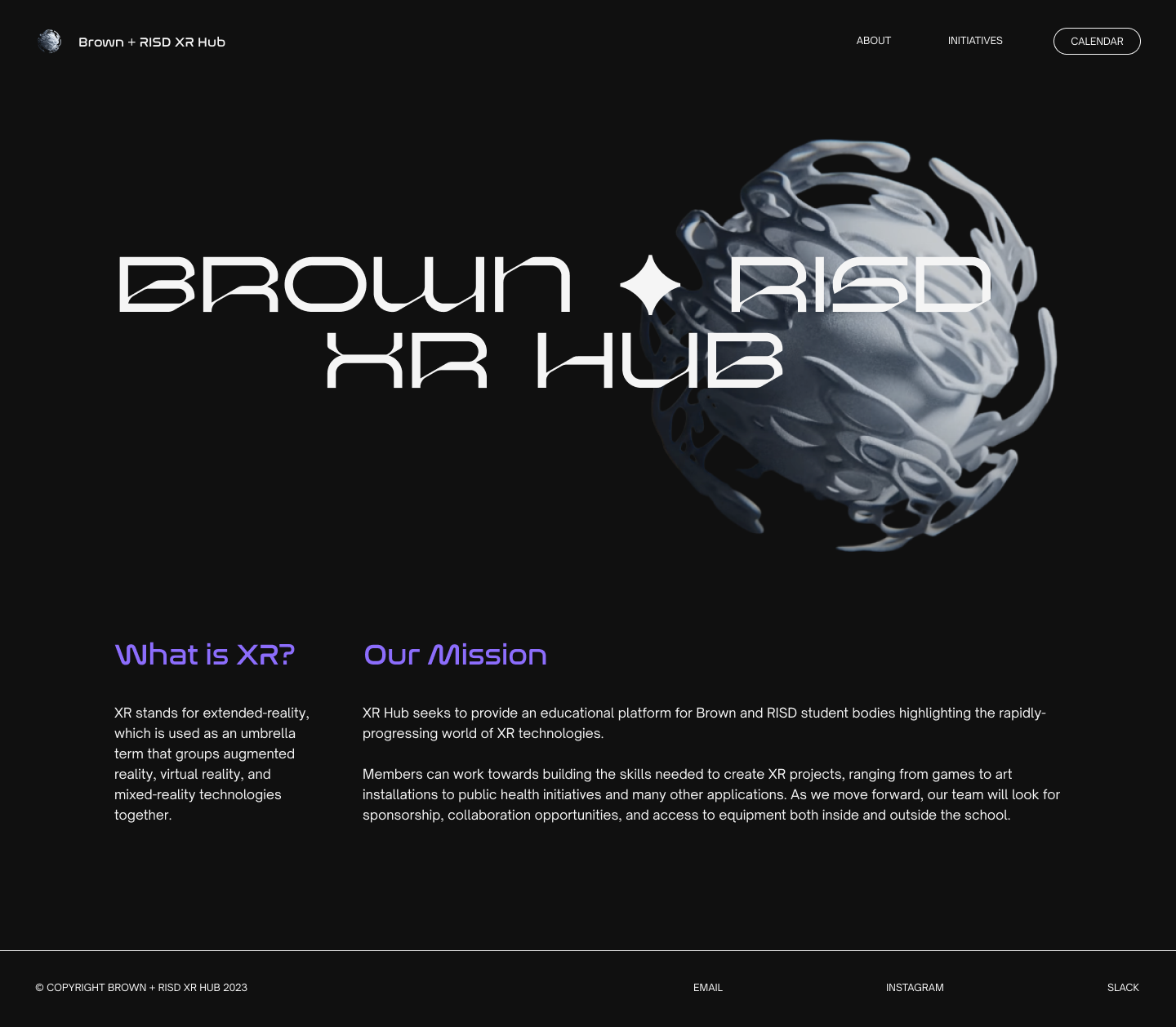

Text-heavy
Spacing issues
Not suitable for background image/video integration
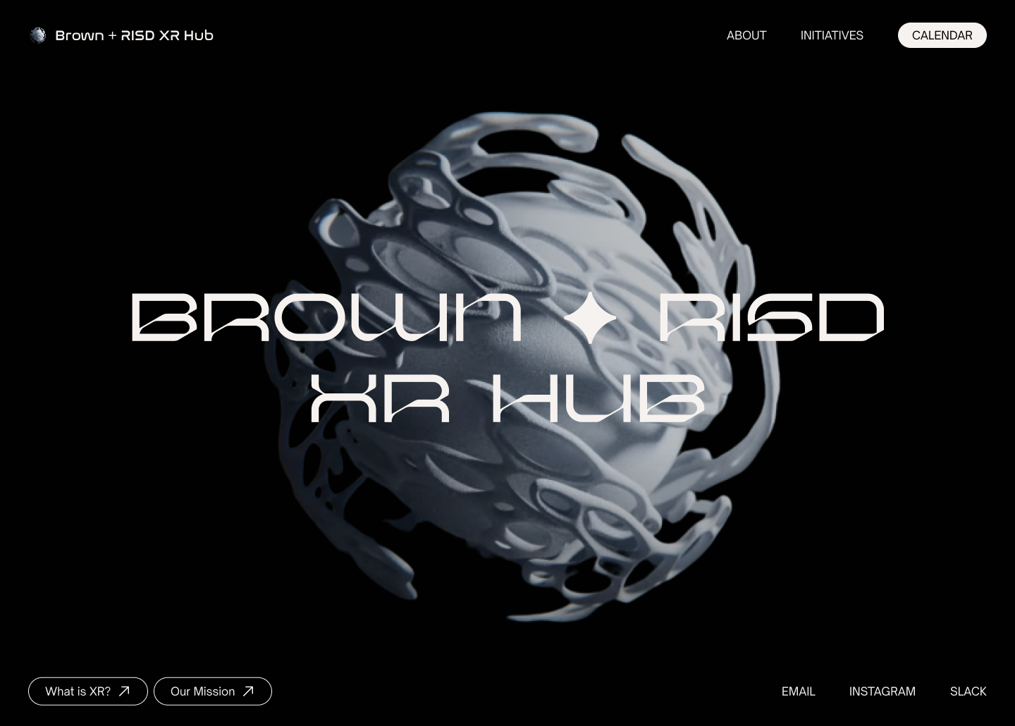

Spacious landing page
Hidden secondary information with buttons toggles
Adjusted spacing in footer
Bold CTA Calendar button
Mouse hover effects
02. About
Better readability with columns, containers, and font hierarchies. Clear card structure for easier development.
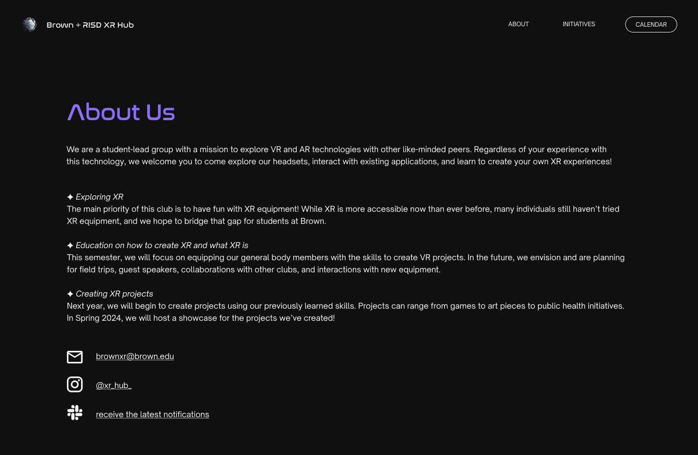
Spacing issues
Lack of font hierarchy
Wide text boxes causing eye strain
Disproportionate icon to text sizes
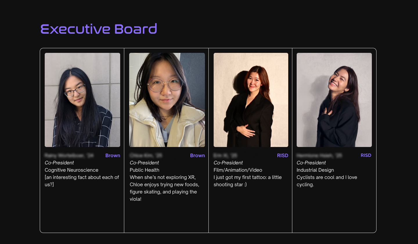
No text groupings
Unresponsive container design
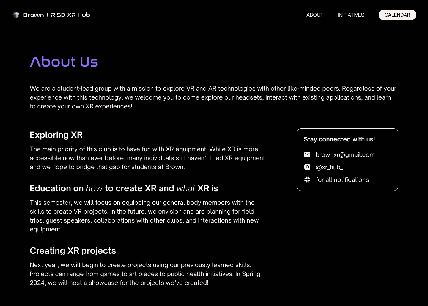
Clear font hierarchy
Columns for better readability
Container for contact/social media handles
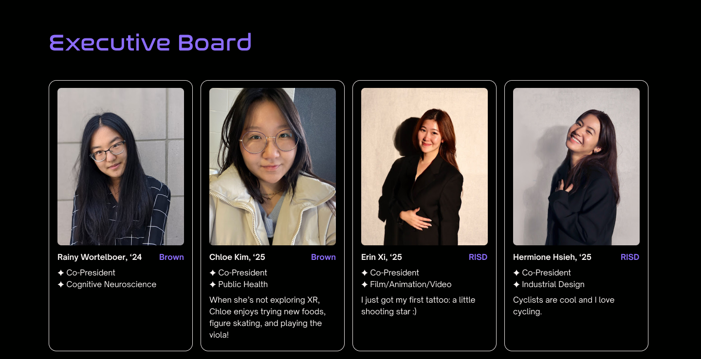
Text groupings with spacing and bullet points
Card structure for easier development
03. Initiatives
Augmented user interaction and experience with tabs and accordions to reduce clutter and give users freedom over what information they want to see. Paragraphs consolidated to bullet points for better readability.
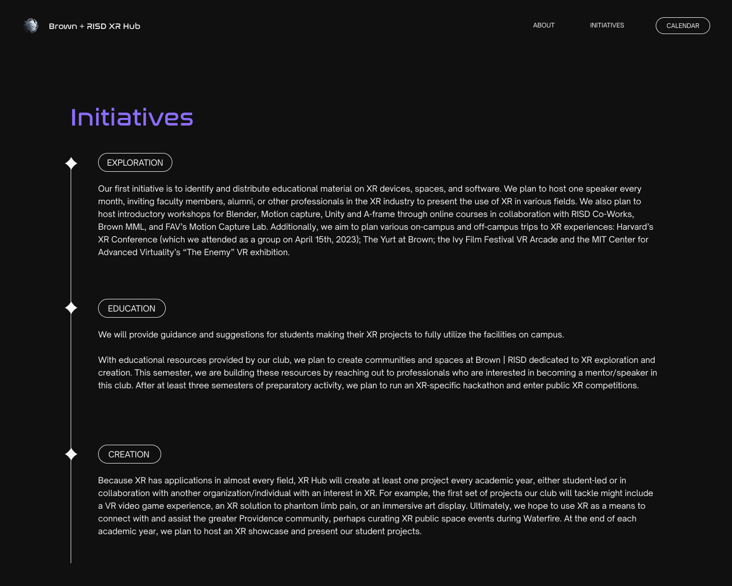
Dense text blocks
Long sections requiring unnecessary scroll movement
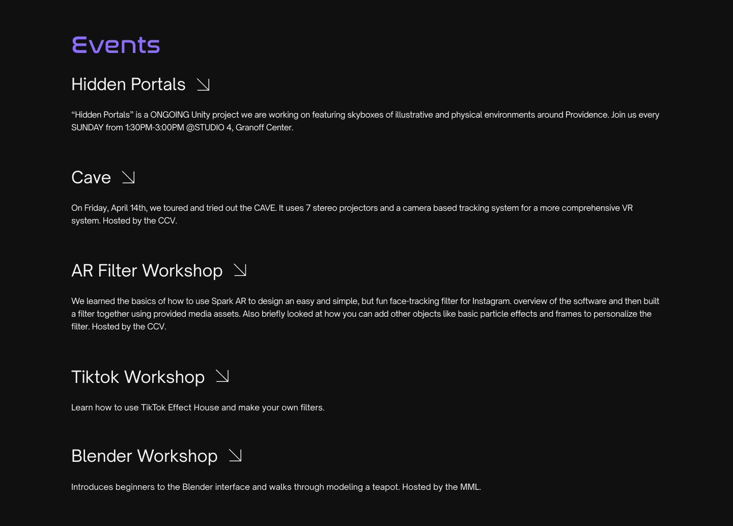
Spacing issues
Misleading unclickable arrows
Wide text boxes
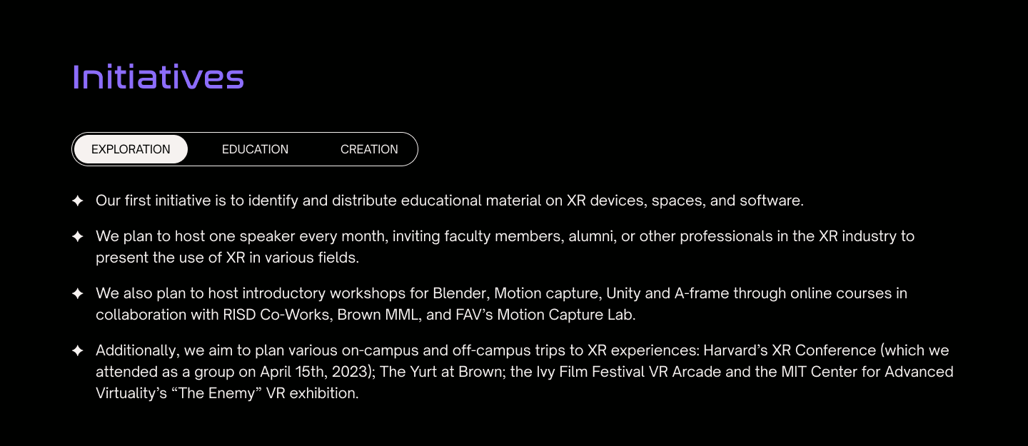
Tabs for greater user interaction
Better readability with bullet points and fixed spacing
Less text displayed at once
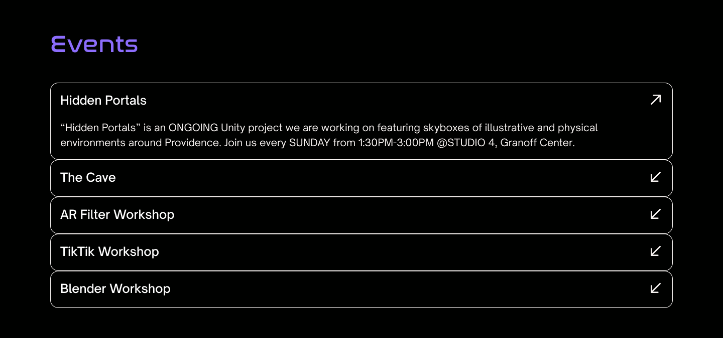
Accordion layout to hide secondary information
Reduced clutter
04. Gallery
Reduced mouse and hand movement with closer button placement. Event descriptions removed to maximize white space and immersiveness.
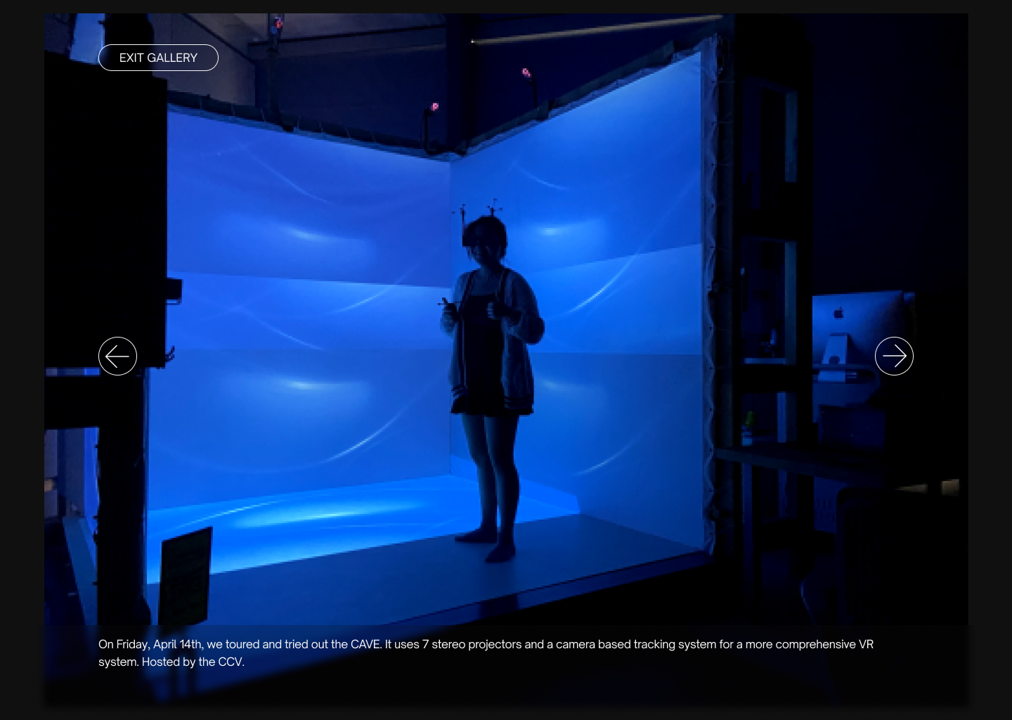
Repetitive information from "Events" accordion
Lots of mouse movement with arrows on opposite sides of screen
"Exit Gallery" button in lefthand corner goes against typical mouse position on right side of screen
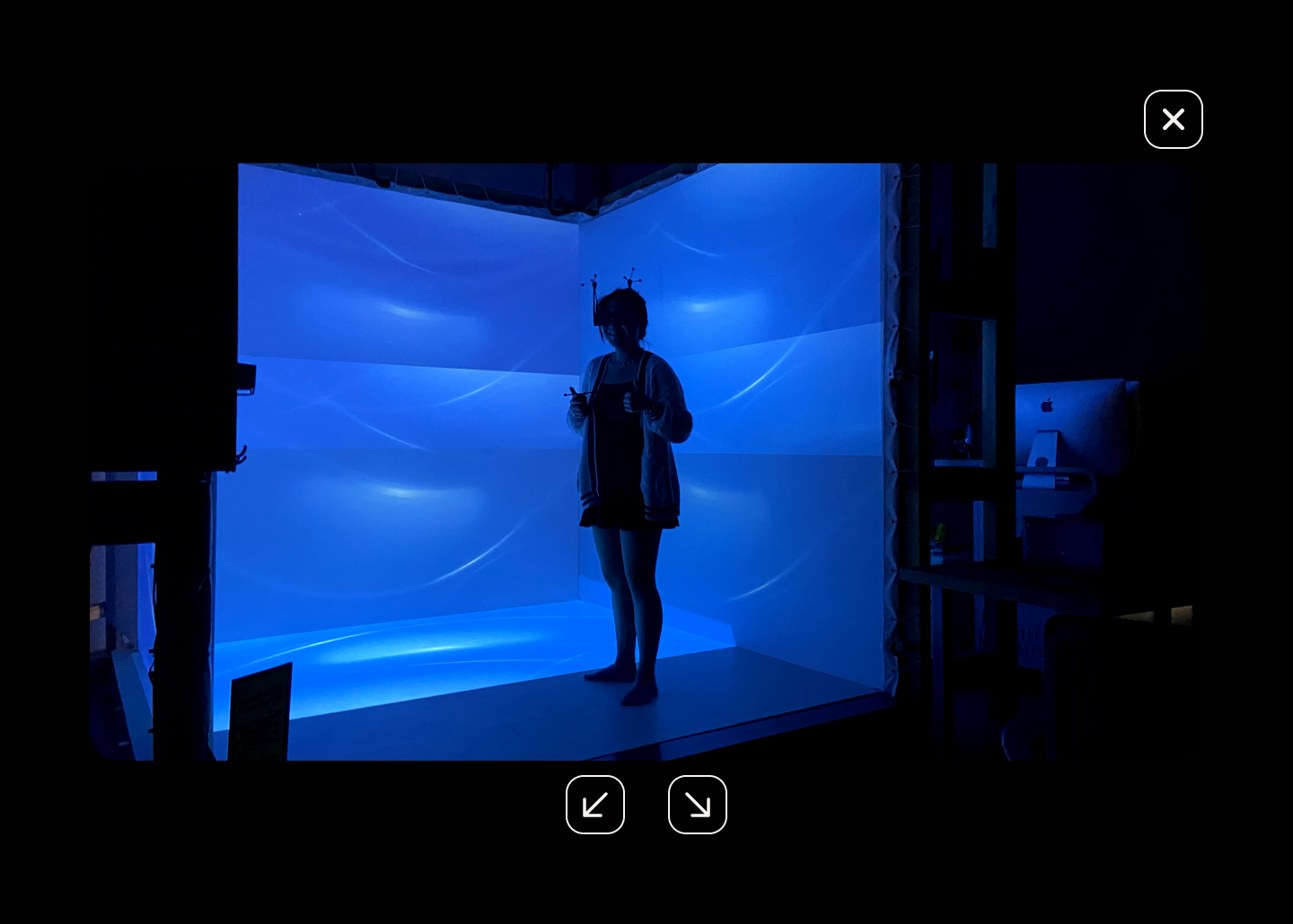
Less clutter
Closer arrows for easier toggling and less mouse movement
New "X" button placement
Design for a user.
This was the first project where I really had to consider what designing for usability would look like. I strived to better present the website information in a readable and accessible way, ensuring users could get all the information they needed out of the website and find more details on topics that piqued their interest.
Ease the design to development handoff.
While working on this redesign, I was also interning at a startup and learning web development in my free time. I learned about Figma's auto layout property and became much more comfortable with HTML/CSS, understanding the tools I needed to make the handoff to our development team easier. I made sure to use precise measurements and reuse as many components as I could for responsive design.
*I'll be coordinating with our Tech Team lead throughout the semester to implement these designs. Check back in a while to see our official club website in action!
Create constraints for yourself.
Since I didn't have much to work with and we hadn't really fleshed out the details of our visual identity, I discovered the importance of establishing both the brand and visual directions myself to keep the website cohesive and unified. I could then cross-check between my work and the guidelines and modify my designs as needed.