UI/UX design
product design
web design
graphic design
OVERVIEW
Passionfroot is a tech startup focused on building a workspace for creators and media companies to handle sponsorships, collaboration requests, bookings, and payments in a single place.
Timeline
June - August 2023, 2 months
Location
Berlin, Germany
ROLE
As the sole design intern, I worked closely with the CEOs, product designer, and my supervisor on numerous projects across creative marketing and product design. My responsibilities included revamping our website, designing new UI components for our product and simplifying existing ones for product showcase graphics, and executing marketing campaigns.
Mentors / Team
CEO — Jennifer Phan, Supervisor — Filip Mark, Product Designer — Alex Kham, Product Lead — Tonia Sun
The website project was a substantial and long-term endeavor that I undertook. One of our primary objectives was to enhance the presentation of our product, providing tangible evidence of its functionality for our users. My specific responsibilities included the design and Webflow implementation of two crucial sections on the hero page: "Empowering the world's top creators and media companies" and "For all creators."
This task posed several challenges. I needed to ensure that my design remained consistent with the overall brand identity of the website while also striking a balance between feedback from both the business and marketing teams, as well as the product design team. This required numerous iterations and adjustments as expectations and requirements evolved over time.
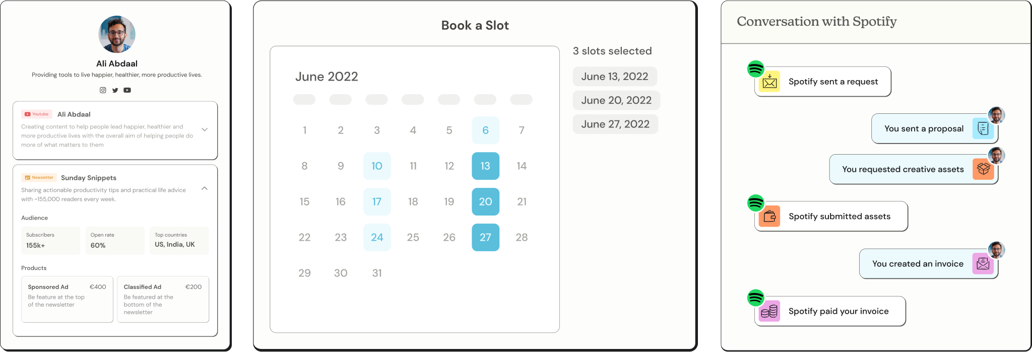
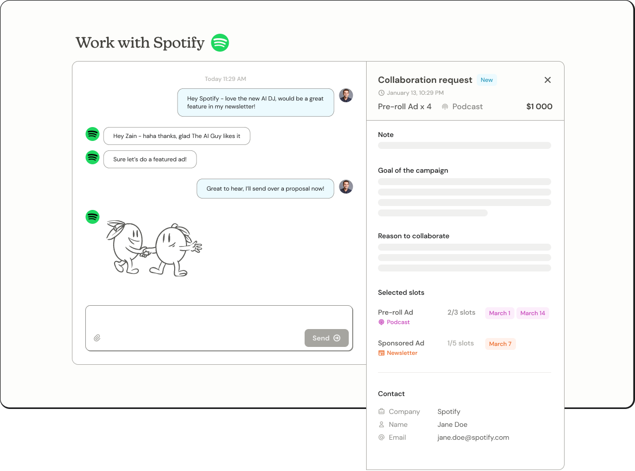
One of my first projects was creating UI elements for our product demo video, which served to provide a comprehensive introduction to Passionfroot and the breadth of our product. Within this context, a substantial part of my role was dedicated to refining and customizing existing UI elements from the Passionfroot product to seamlessly suit the specific advertising medium in use.
Challenges
One of the challenges of this came with figuring out what information was important for a viewer in order to actually showcase our product in an easily understandble way and which information to get rid of. It also came with slightly modifying the design language like brightening up some colors and adding borders and border shadows to make things stand out to suit the appeal of a product demo video. This project challenged me and helped me solidify my understanding of Figma, especially in the use of auto-layout and components.
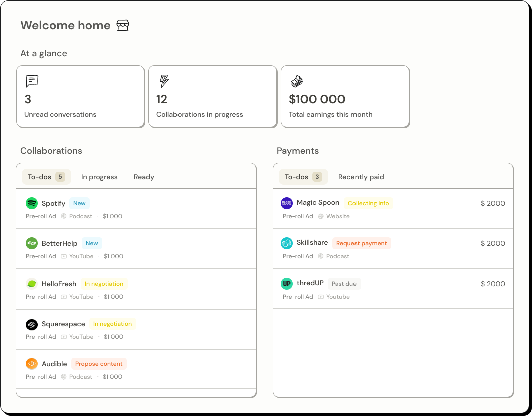
01. Home UI for product demo video
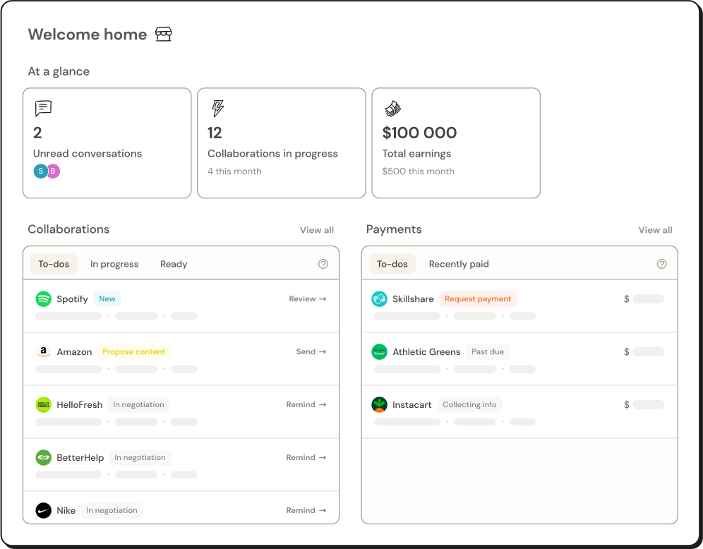
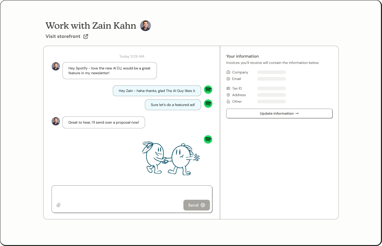
02. Home UI for website
I designed the home screen UI element for two distinct platforms: a demo video and a website. Despite their similarities, there are subtle variations between the two. The demo video UI appears more dimensional with the use of drop shadows, vibrant colors, and depth of color. On the other hand, the website's UI opts for a flatter design and relies on skeletons to maintain a minimalistic look. This aesthetic aligns more harmoniously with the pre-existing website's UI, guaranteeing that the image does not contribute to the overall visual complexity of the site.
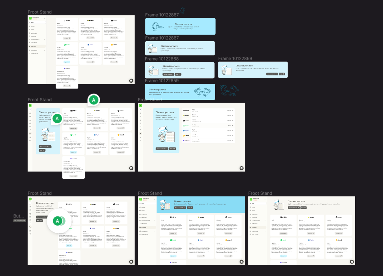
For our Discover MVP launch, a feature that would allow creators to connect directly with partners for collaborations, I was responsible for redesigning the page to make it more lively, attractive, and fun. My main contributions were creating a grid layout and creating a vertical two-column layout with the header and the card grid.
Grid layout for partner blocks
I found that the table structure had a hierarchical feel, resembling a to-do list, which might make creators feel pressured to methodically go through each partner one by one. On the other hand, the grid format seemed more like a job board and offered better scalability, especially if we needed to include additional information about the partnership.
Two-column page format
As the product expands and additional partners join the page, users shouldn't have to scroll to the top to find "how it works" or access essential information. To address this, we will ensure that the left-hand side remains fixed or sticky. Furthermore, we have the flexibility to incorporate more information on the left side without impacting the content on the right.
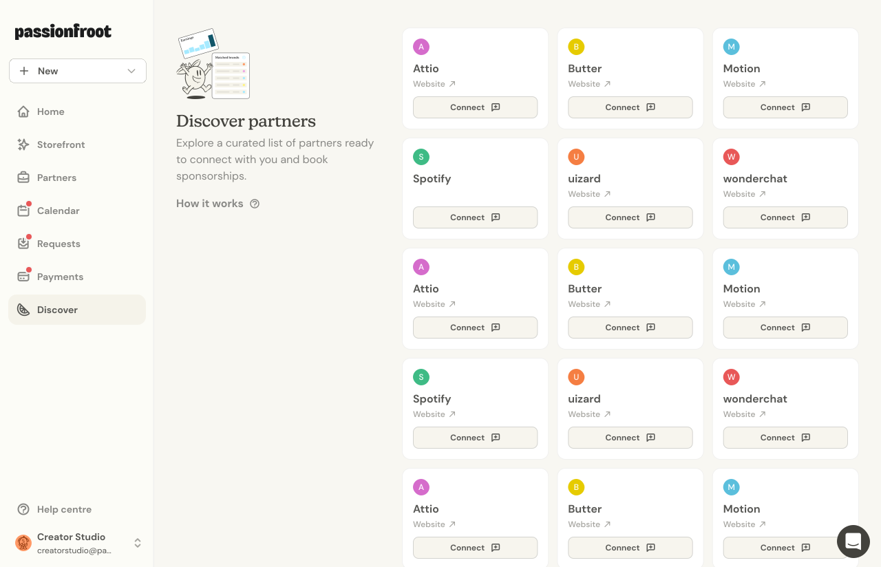
01. Discover
Expanding upon my designs, our product designer incorporated both the grid and a two-column layout, aligning the page more closely with our guidelines and de-emphasized the left side for a balanced user experience. In the MVP version, partner representations were simplified to icons without extra details.
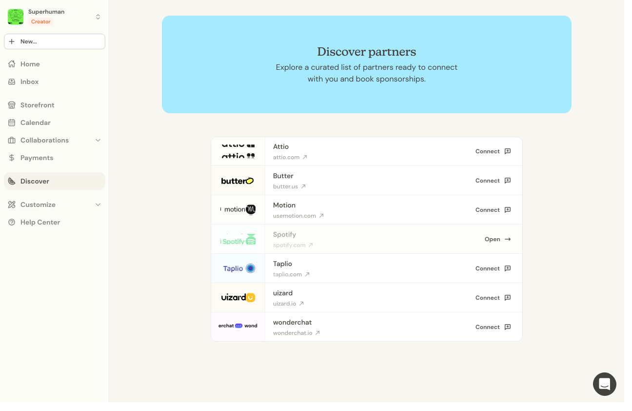
01. Discover
Expanding upon my designs, our product designer incorporated both the grid and a two-column layout, aligning the page more closely with our guidelines and de-emphasized the left side for a balanced user experience. In the MVP version, partner representations were simplified to icons without extra details.
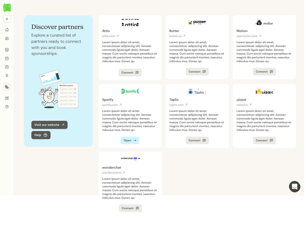
01. Discover
Expanding upon my designs, our product designer incorporated both the grid and a two-column layout, aligning the page more closely with our guidelines and de-emphasized the left side for a balanced user experience. In the MVP version, partner representations were simplified to icons without extra details.
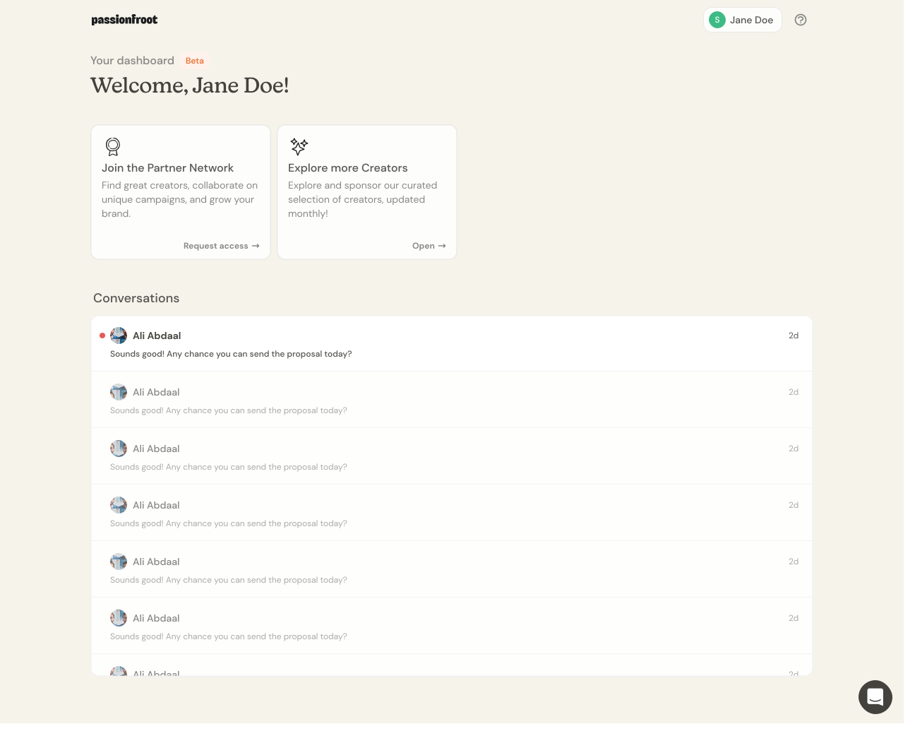
02. Partner Cards
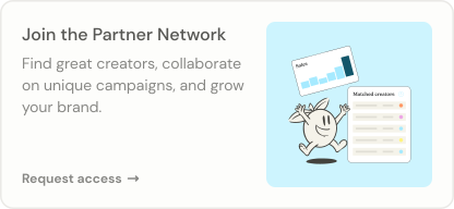
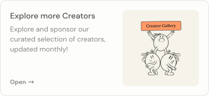
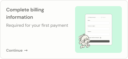
For our Partner Workspace launch, I redesigned the cards on the home screen to enhance their visual appeal by incorporating more vibrant colors and graphics to improving the overall aesthetic.
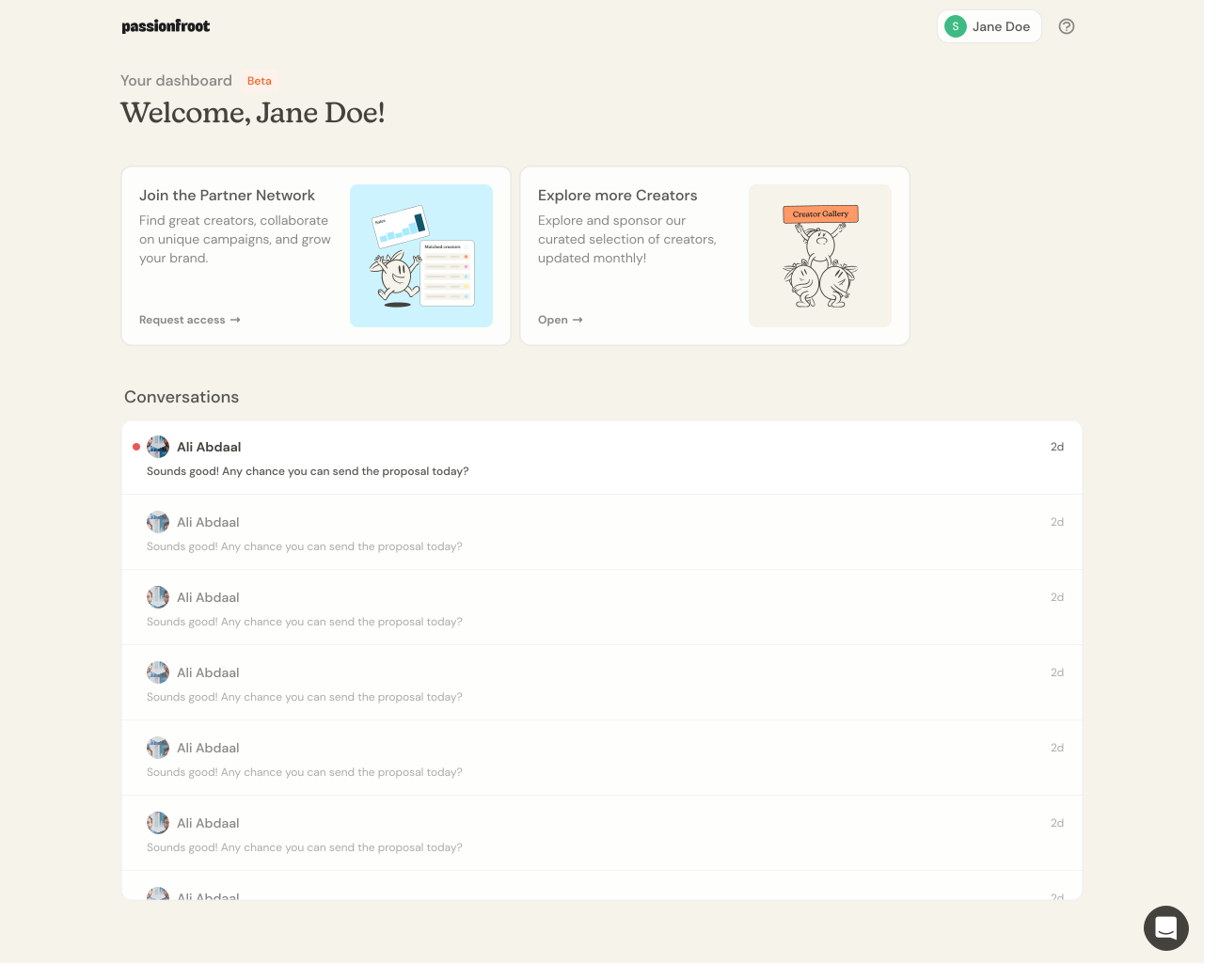
02. Partner Cards
For our Partner Workspace launch, I redesigned the cards on the home screen to enhance their visual appeal by incorporating more vibrant colors and graphics to improving the overall aesthetic.
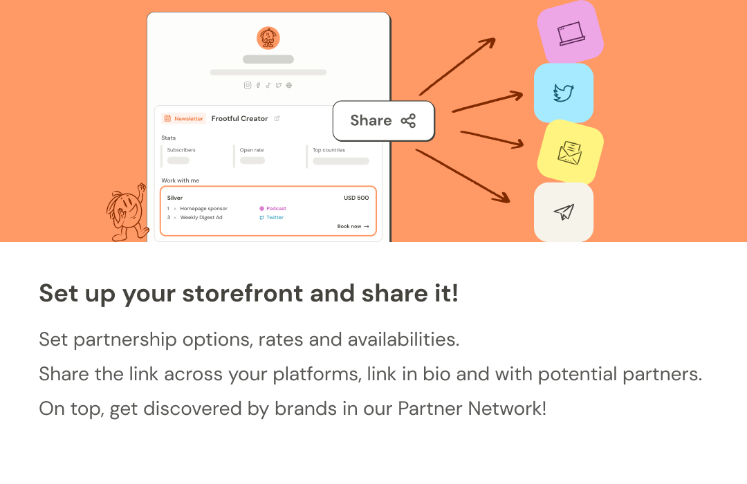
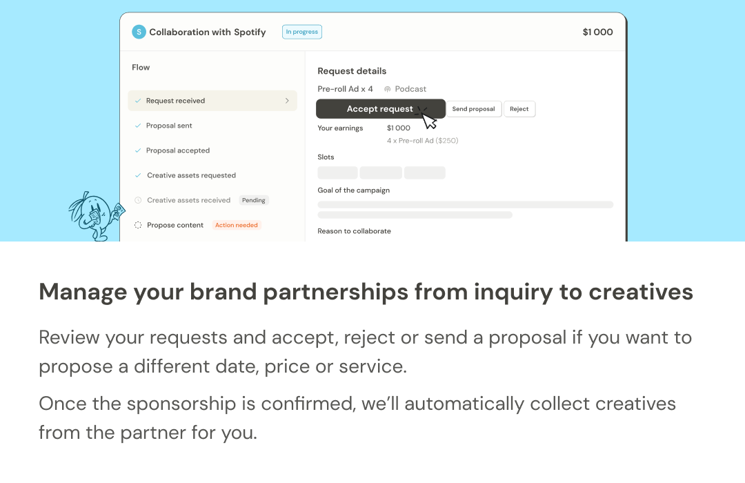
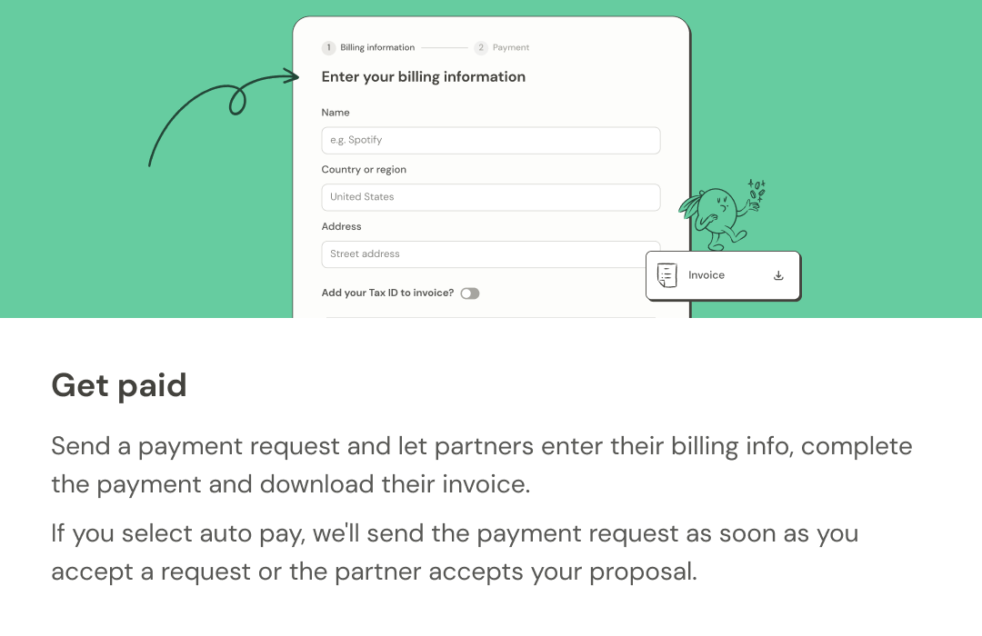
Swipe right to navigate the carousel above →
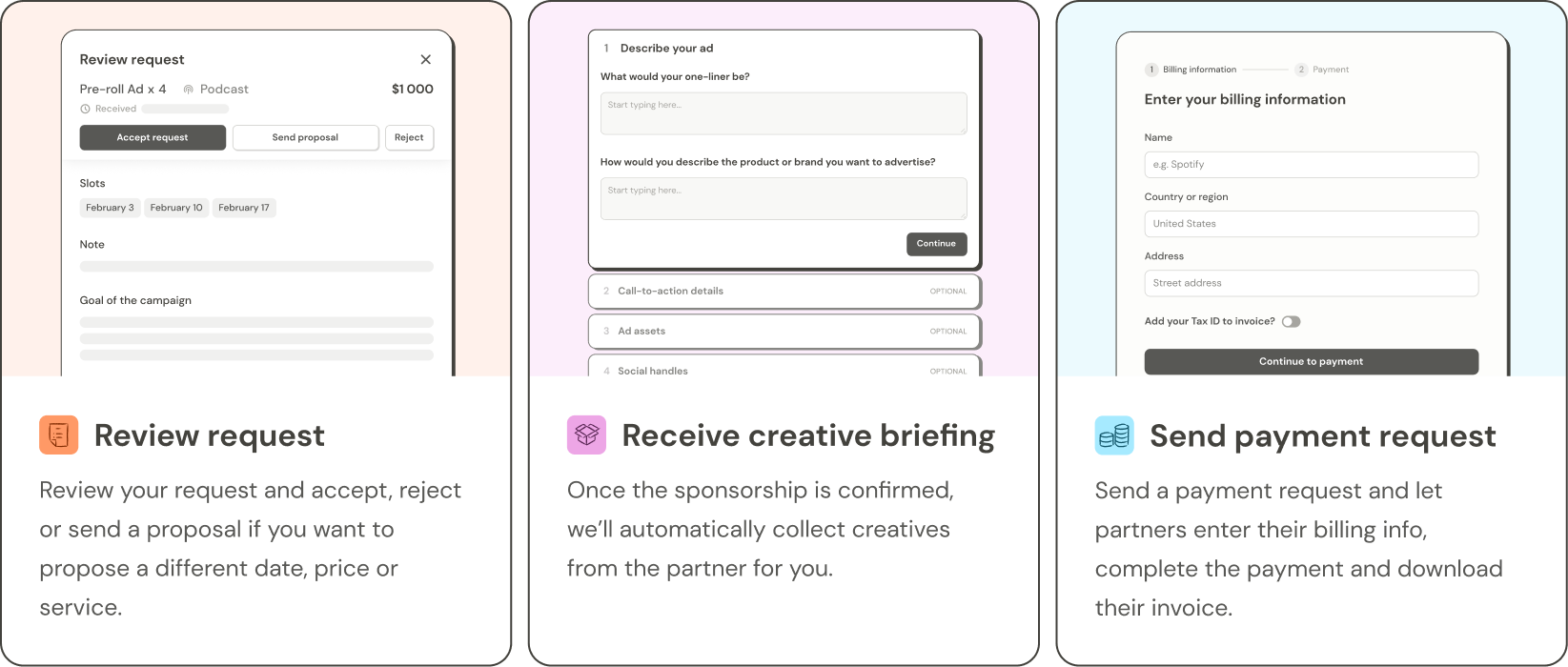

Swipe right to navigate the carousel above →
I grew tremendously as a designer and had the amazing opportunity to work in both marketing and product, areas I had expressed interest in during my interviews. I could not have asked for a better first internship.
Develop a stronger design sense and proceed with reason.
Having had my first exposure to product design, I gained an immense amount of knowledge from working closely with our product designer on a few projects. But being in constant back-and-forth communication with my co-workers, I learned to be much more intentional about my design choices and always have a rationale to back up my decisions.
Working in a fast-paced environment.
I learned what it was like to work at a startup and how the product cycle works by being a part of multiple product feature launches during my 8-week internship. Working in a fast-paced environment, I learned to effectively pace myself in order to deliver on time and be more comfortable sacrificing perfectionism for punctuality.
Appreciating the iterative design process.
Whenever tasked with a project, I'd make over 10 iterations of a design before getting them reviewed to make sure I experimented enough and explored as many possibilities as I could. In the beginning, I felt frustrated whenever I had to constantly go back and redo my designs. Looking back on my work and comparing my final designs to my first, I'd always feel grateful for all the steps I had to take to get to the end result.
Don't treat brand guidelines as stagnant.
Having to reference the same brand guidelines every day, I became very familiar with our design principles. However, towards the middle of the internship, I began to feel limited by the guidelines and decided to proceed forward with new styles and icons. Although I often was advised not explicitly mentioned in the guidelines, I advocated for myself and created more interesting designs with my new ideas that still aligned with our guiding principles, just not as strictly.